Case Study
Ever by Ellie
A Brand Identity and Website Collaboration
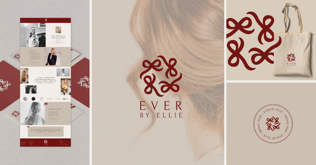
When Ellie came to us, she was ready for a fresh start. As a luxury bridal hairstylist, her work has always carried that blend of elegance and effortlessness brides are looking for. But her branding and website weren’t showing that off. This is where The Collab Club collaboration came in: Sammi at Make it Pretty Creative took the lead on Project Management and Brand Identity Design, while M Co Creation designed and built the new Squarespace Website. This is the story of how Ever by Ellie was created.
The Brand: What’s in a name?
From the first call, Ellie explained that she was considering a name change. Her original name, Love Hair by Ellie had been with her from day one. But wanting to maybe broaden her services in the near future, she wanted something less tied to hair. During research, it became clear that a name could help shape the identity and give it longevity and whilst this is not Sammi’s usual area of expertise, she waded in anyway. Ever by Ellie came to life. The “Ever” nods to both timelessness and the wedding world (“ever after”), while the alliteration makes it memorable. It is both confident, inviting and fits Ellie’s vision of classic bridal glamour.

The Colour Palette: Saying Yes to Red
In her Brand & Website Questionnaire, Ellie was certain of one thing…she didn’t want red in her branding. But during moodboarding, Sammi kept coming to the same thought. Ellie’s questionnaire had a running theme across dream clients, aspirational brands and her professional style. Wanting to lean into high-end, vintage Hollywood glamour and romance that would set her apart from the monochrome minimalism that dominates the wedding industry, Sammi kept coming back to deep, sultry reds (think Charlotte Tilbury and Cartier levels of romance). Old Hollywood glamour, romantic styling, richness.Keen to not ignore Ellie’s wishes, Sammi developed 2 moodboards. One showcasing this vision and one leaning more towards sages and light tones (which Ellie had identified in the brand designs of peers she admired). Ellie’s reaction? Immediate agreement that red was the way the creative direction should go (yay!). The brand suddenly felt bold, stand out, high-end and exactly the kind of luxury she wanted to embody.

The Bow: A Signature Flourish
For the logo and brand mark, Sammi wanted something personal and iconic. The answer came in the form of a bow designed from two “e” letters. Elegant, simple, and packed with meaning.The bow can feature as a stand alone icon, but when used in logos has been arranged into a square format to give the feel of a pattern and represent the bridal party as a whole.
From there, a full logo suite was developed:
Primary Logo: Combining the bow with the brand name in a serif font.
Variations: Horizontal and stacked formats for flexibility and even a brand stamp.
Brand Mark & Icon: Standalone bow or simplified versions for subtle touches.
This made it easy for Ellie to apply the brand across everything from print materials to social media templates.

The Final Look: A Bold and Personal Brand
The finished brand identity was delivered in a complete Brand Manual:
Logo Suite: Primary logo, variations, brand mark and icon, each with rules for sizing, spacing and use.
Typography: Italiana for headings (timeless, elegant), Lato for body text (approachable, modern). Together, they create balance and consistency.
Colour Palette: Merlot red as the hero, paired with neutral buff and powder shades, dark noir accents, and clay as a highlight to draw attention when needed.
Brand Pattern: A repeating bow motif for backgrounds or subtle overlays, adding texture and depth.
Usage Guidelines: Rules for colour hierarchy, logo placement and misuses, ensuring the brand stays polished no matter where it’s applied.
This meant Ellie didn’t just walk away with impactful visuals, she left with a fully usable toolkit that will support her brand for years to come.
The Website
Once the brand identity was finalised, M Co Creation took the wheel with website design. Built on Squarespace, the site balances elegance with functionality. Think clean layouts, clear navigation, and plenty of space for Ellie’s work to shine. It’s the kind of site brides will happily get lost in while scrolling for inspiration.

The Inspiration
For the website design, Miriam drew inspiration from an editorial aesthetic that balances modern style with timeless romance, creating a striking yet elegant contrast that feels both luxurious and intentional. To reflect the artistry of wedding photography and hairstyling, the design weaves together both coloured and black-and-white imagery. The coloured photographs highlight the florals, textures and emotions, while the black-and-white images introduce a classic, cinematic quality that feels emotive and authentic.
For the layout, Miriam wanted to create a structured yet fluid look, allowing imagery to take centre stage and stories to unfold naturally, much like a magazine spread.
Overall, the style communicates a sense of understated luxury, modern and intentional. It positions the brand as more than just a service provider, but as a storyteller who captures beauty and emotion with artistry and care. Take a look


Final Thoughts
This project shows what can happen when branding and web design work hand in hand. The result is a high-end, confident brand identity paired with a digital home that does it justice. Ever by Ellie is now ready to welcome brides into a world of timeless beauty, and we’re thrilled to have had a seat at the table.

“The attention to detail is insane. Having a complete rebrand was a big step for me including a name change, (Sammi actually came up with my new name). She is so patient and understands the importance of getting everything just right.
I am over the moon with my new branding and I cannot wait to share the final result. Thank you so much again, I will miss working with you.”
Ellie


