
Case Study
Feioi - Interior Designer
The Brief
When Jen approached Sammi about a potential brand design project, it quickly became clear this would be a true end-to-end collaboration. Jen is the founder of Feioi, a creative and personal interior design studio delivering beautiful, functional spaces for real people with real homes. With a focus on thoughtful design that reflects individuality, Feioi blends creativity with technical precision to create interiors that feel both approachable and aspirational.
Jen’s ethos is that people should feel inspired by their spaces without losing their own sense of self within them, designing homes that people can truly love and live in. The goal of the rebrand was to translate that philosophy into a cohesive visual identity: positioning Feioi as a cool, confident and established presence in the interior design space. Moving away from monochrome minimalism, the new identity would embrace earthy, muted tones with an edge, balancing warmth with style while bringing Jen’s creativity and personality to the forefront.
To bring this vision to life, the project was scoped as a full creative collaboration including:
Brand Identity Design
SquareSpace Website Design
Website Copywriting
Brand Photography
Brand Stationery Design
Brand Roll-Out
This became one of our largest collaborative projects to date, bringing together a carefully selected creative team to bring this vision to life. Each element would be developed together to ensure the brand felt consistent and considered across every touchpoint, from Jen’s online presence through to the materials she shares with clients.
The Brand Identity
The goal of Feioi’s new brand identity was to feel effortlessly cool while remaining warm and welcoming, reflecting how Jen “brings love into every home” without being too literal or cliché.
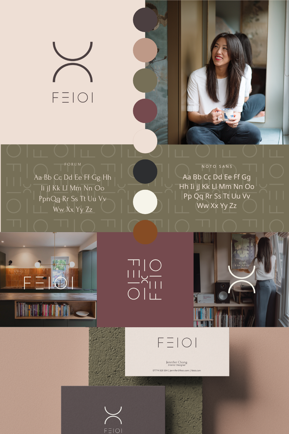
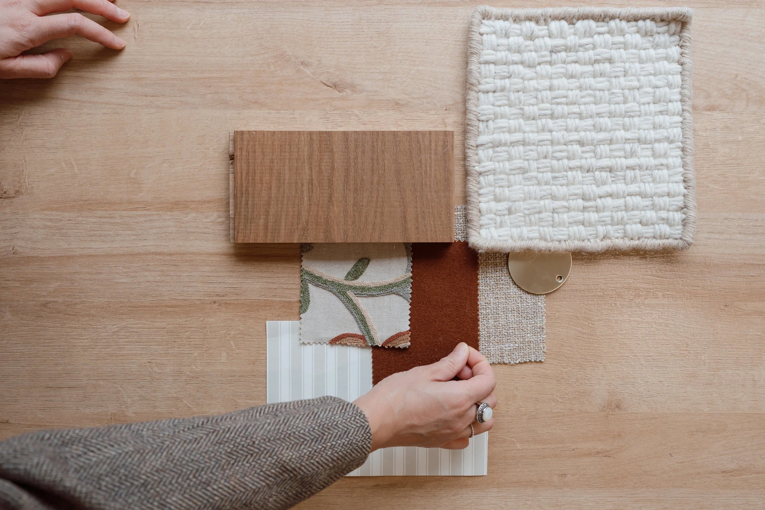
Through research and mood-boarding, it became clear that Feioi has an “autumn” personality: grounded, organic, and trustworthy. Colour played a central role, with a palette that felt seasonal and sophisticated without leaning into predictable autumn tones.
We explored three logo concepts, from a refined evolution of Jen’s original identity to a minimal direction featuring an arch icon symbolising openness, invitation, and stepping into a space that feels like home. The final identity combined elements from multiple concepts, along with a carefully refined colour palette and typography system, creating a brand that feels authentic, cohesive, and flexible across digital and print.
At the heart of the visual identity is the primary logo, anchored by two mirrored arcs. These represent balance, flow, and harmony between beauty and practicality, individuality and comfort, tradition and modernity. Its abstract shape hints at familiar forms (a doorway, a bowl, or a vase) as subtle reminders that home is defined by thoughtful details. The icon is applied across a full logo suite, with variations and a standalone brand mark for flexibility without losing Feioi’s minimal elegance.
The brand pattern repeats elements of the word mark and brand mark in a balanced, geometric grid, creating rhythm and flow. Used sparingly, it works as a background, accent, or statement, maintaining Feioi’s clean, modern aesthetic.
Colour and typography reinforce the brand’s personality. The palette blends deep, muted shades for an aspirational yet approachable feel, while Forum headings provide a modern serif touch and Noto Sans ensures body text is clear, accessible, and friendly.
With the visual identity established, the next step was bringing the brand to life across every touchpoint, from the website and copy to photography and stationery, ensuring consistency and creating a fully integrated brand experience that truly represents Feioi from first impression to client interaction.
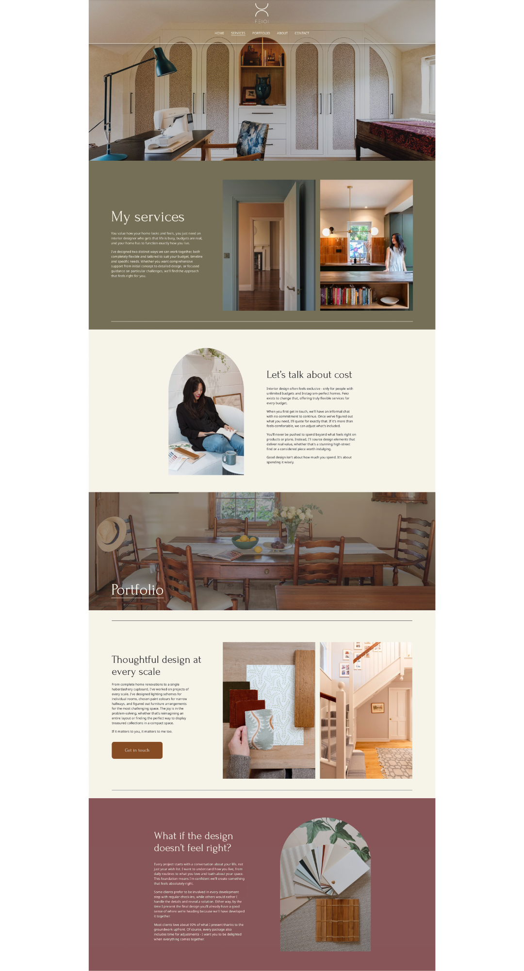
Website Design
The focus for the website was to create a digital space that not only reflected Feioi’s new branding, but also allowed Jen’s interior design work to really shine. Using the updated logo and brand elements as a starting point, Miriam carried some of those details through the design of the site itself. The soft curves within the logo inspired the use of arch imagery throughout the website, a subtle nod to the brand mark, but also to architectural shapes often found within interior spaces.
Alongside this, the straight lines within the logo influenced some of the more structured elements of the layout. These clean lines help balance the softer shapes and give the site a calm, considered feel, something that mirrors the thoughtful approach Jen brings to her interiors.
Colour was another important part of the design. Miriam wanted to create a balance between light and dark tones across the site, using the richer brand colours in certain sections to add depth, while lighter areas help create a sense of space and airiness.
Banner imagery also plays a big role in the experience. Featuring large interior images throughout the site helps give visitors an immediate feel for Jen’s work and the range within her portfolio.
Another small detail was incorporating the monogram icon designed by Sammi into the site as interactive dropdown elements. These allow extra information to expand when needed, keeping the pages feeling clean and uncluttered while still offering more detail for anyone wanting to explore further.
Overall, the website has been created to feel calm, spacious and aligned with Feioi’s new brand, while giving Jen’s beautiful interiors the space they deserve to take centre stage.

Brand Photography
Photography is often the glue that brings a brand to life, and for Feioi, capturing both Jen’s work and her personality was essential. Photographer, Trish worked across multiple locations, photographing Jen’s client projects as well in a studio, to create a library of images that felt authentic, dynamic, and consistent.
Showcasing Feioi’s interiors as spaces that are both beautiful and lived-in, highlighting the thoughtfulness, individuality, and functionality that Jen brings to each project was the overall vision for the sessions. At the same time though, we wanted the images to reflect Jen herself - approachable, creative, and down-to-earth - so clients could connect with her personality before even stepping into her studio or welcoming her into their homes.
Trish’s photography provides flexibility across all brand touch-points and she worked closely with Miriam in particular to ensure that shots were caught specifically for placeholders on the website. The images bring cohesion, depth, and warmth to the brand. Detailed shots, wide-angle room compositions, and subtle lifestyle elements combine to tell a story that feels real, inviting, and aspirational. The resulting library ensures that every piece of communication, whether digital or print, maintains the same consistent look, feel, and tone, reinforcing Feioi’s brand at every opportunity.
Website Copy
The website is often the first point of contact for potential clients, so the copy needed to be as thoughtful as the interiors Feioi creates. Working with copywriter Ellie Senior, Jen’s content was completely reimagined from the ground up. While the original website was rich in information, it felt overwhelming and inconsistent, making it potentially challenging for visitors to connect with Jen’s story and services.
Once the Brand Design was handed over with initial commentary on tone of voice and brand style, Ellie took Jen through in-depth interviews and discovery sessions to capture her voice and ethos. This ensured that the copy reflected not only her personality but also her approach to design; warm, approachable, and meticulous. Each page was curated to guide visitors naturally, balancing inspiration with clarity, and providing just the right amount of detail to inform without overwhelming.
The copy works seamlessly alongside the visual identity, website and photography, working as part of a cohesive brand ecosystem. Headlines, subheadings, and body text were structured to support user flow and hierarchy, helping clients quickly understand Feioi’s services, process, and style. Beyond functionality, the tone and phrasing were carefully considered to engage, build trust, and ignite curiosity, creating a website experience that feels welcoming, authentic, and aligned with the elevated yet approachable identity of Feioi.
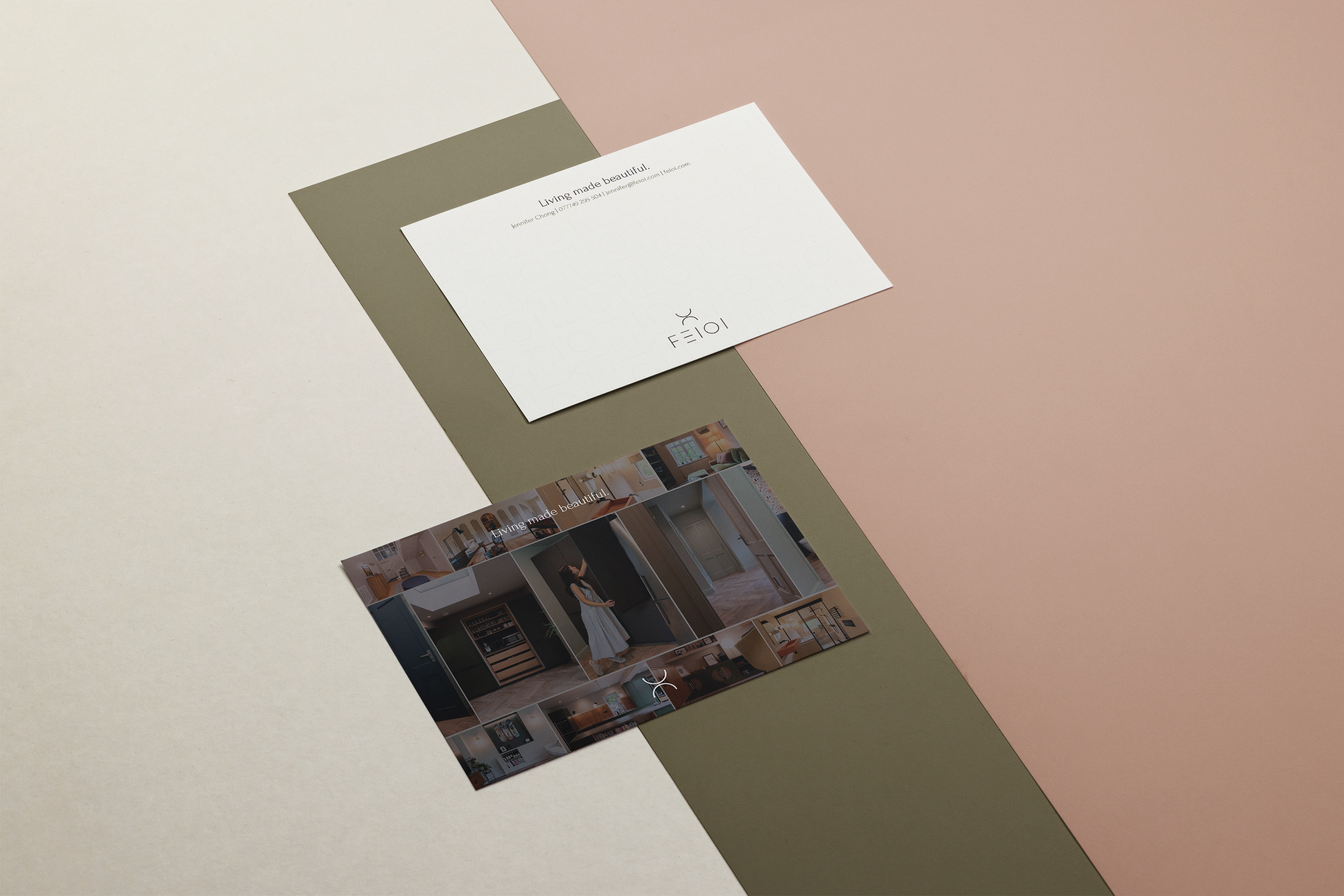
Brand Stationery & Roll-Out
Working from the newly created Brand Manual, Sadie designed Jen’s client brochure as a key touchpoint for communicating her services and approach. The layout, typography and colour palette were carefully applied to ensure the brochure felt cohesive with the wider brand, while still allowing space for Jen’s projects to take centre stage.
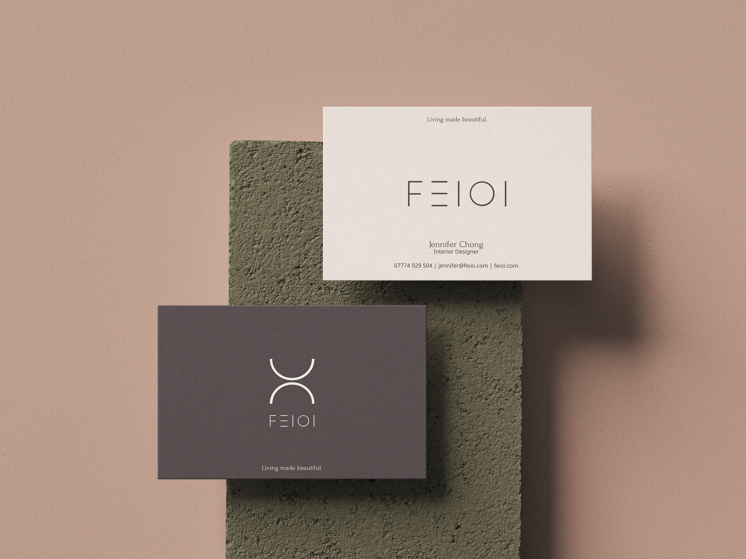
Sammi supported this with the design of simple, minimal business cards and compliment slips, extending the brand across Jen’s everyday printed materials. Trish’s brand imagery and selected portfolio photography were woven throughout, ensuring each piece not only felt consistent but also showcased the quality and personality of Jen’s work.
Together, these stationery elements created a polished and practical set of assets that Jen can use confidently with both new and existing clients, reinforcing her brand at every stage of the client journey.
The Outcome
This project brought together brand identity, digital design, copy and photography into one beautifully aligned system that reflects how Jen works and who she works for. By collaborating across disciplines and managing the project as a single, joined-up process, we were able to create a brand that feels consistent, considered and ready to grow with the business. The result is a brand for Feioi that feels as personal and intentional as the interiors Jen creates and is a clear example of how The Collab Club brings together the right people to deliver thoughtful, end-to-end brands for businesses.
The Team
Sammi
Project Lead | Brand Designer | Stationary Designer
Miriam
Web Designer
Trish
Brand Photographer

Sadie
Brand Rollout

Ellie
Copywriter